Salone Internazionale del Mobile is THE well known annual trade show for design in Milan. The fair is really big and a lot of events are also happening all around the city in old industrial areas such as Zona Tortona and Ventura Lambrate ….
Milan is always exciting even if spring was not there this year Despite people saying it was not such a “great” year, I found interesting signals at Salon Satellite the section dedicated to new designers under the age of 35 . Lot of schools were also showing brilliant students projects such as ECAL with an intimist show on “The iceland Whale Bone Project”
The global trend of the Salone is that in this crisis period we are looking for clear point of view and affordable pieces. We saw clear statements every where with words, simple colors and bright fluos or with warm material such as copper. Let’s go!
Words
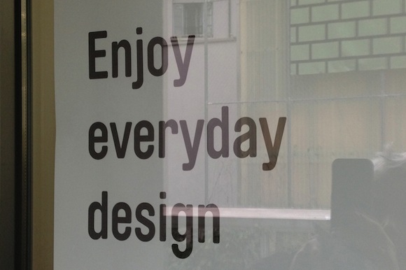
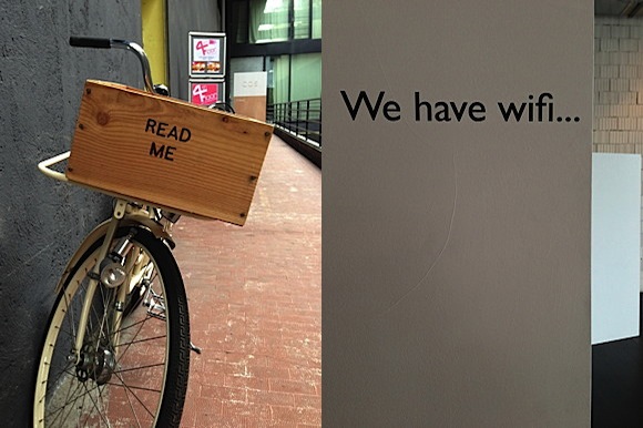
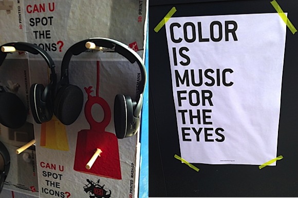
A lot of messages in regular typefaces were written on the walls.As if, Tired of images, words seem more meaning full today.
Copper
Copper was every where this year . Its warm color brings something new to our home or to the Tea House imagined by Tom Dixon at the MOST . This metal is very often used in addition to another material such as wood or bark to make it more precious.
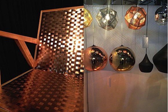
Left Silla Atacama at Universidad del Desarrollo / Chile. Right : Tom Dixon at MOST
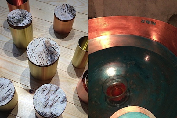
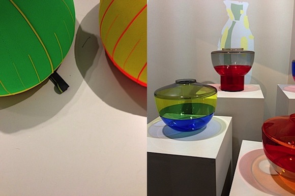
Left : Matti Syrjala for Kaamos . Right Patina by Alhambretto
Klein Blue
The revival of this fantastic color is coming. IKB – International Klein Blue- was chosen by Ros Lovegrove for Renault with the concept car Twin’Z and by Mariscal for Artemide. To follow….

Left Roos Lovegrove for Renault . Right Mariscal for Artemide
New Simple
Simplicity is back with design inspired by Scandinavian values and archetypes: colors, usefulness… Japanese company such as Karimoku Newstandard or Korean designers are also inspired by this growing trend. Christophe Pillet designed a collection of colored vases for Kartell which translate well this new simplicity. One of the best example is “The capsule” by Tom Dixon for Adidas: a collection of design-driven travel bags, garments and footwear available in stores from mid November 2013.
Left : Design academy Eindhoven ; Right : Karimoku Newstandard
Left: Hello Jongerius for Vitra. Right: Christophe Pillet for Kartell

“The Capsule” by Tom Dixon for Adidas
Fluo
Fluos are still used this year as accents or in monochrome statement. Even if this trend is already in the market we see that will last a while.
CMYK designed by Dennis Parren is a LED-bulb that makes colored shadows and was on show at Rossana Orlandi . CH05 , a simple pink monochrome chair by e15 was a very refreshing and strong item!
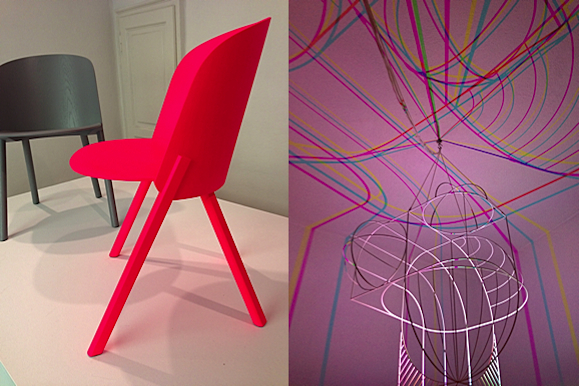
Left: CH05 by e15. Right: CMYK by Dennis Parren
Process
In praise of Process could be a subtitle for this year : schools such as Design Academy from Eindhoven choose to display under the idea of “Linking Process” , The Royal Academy of art The Hague set up instalations was called “Live Factory made my day” both were proudly showing the visitors the process of Design. A very successful lesson !
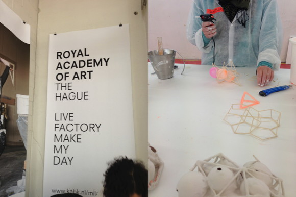
Royal Academy of Art The Hague / Live Factory made my day
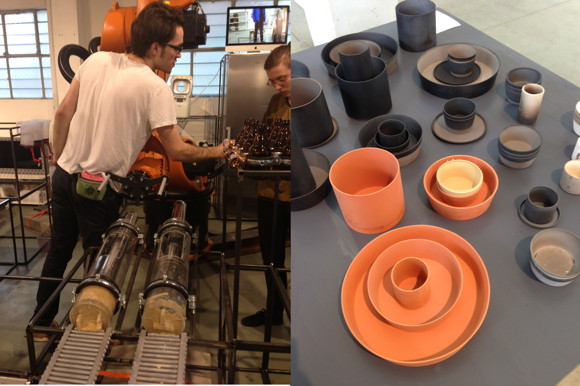
Left : School of Form / Poznan. right : Design Academy Eindhoven